
 |
| Holy crap - ROCKS!!! |
If you've been reading Power Out, then you know I have something of an obsession with natural textures. And I LOVE drawin rocks! There's just something about em - solid, interestingly shaped - like other natural things, you can throw so much of your interpretation to it. When you draw a 1984 Ford Escort, you don't have too much room for interpretation. But you can put whatever you want into natural stuff, and you can fudge the details!
 |
| Look! This is what rocks look like! |
I got pretty good at drawing rocks when I was doing portraits of Haitian landscapes to benefit earthquake victims. I would draw a lot from photographs, and even though your hardass art teacher will tell you drawing from life is better (which it is), you can still learn a lot from using photos - even lo-res ones off the internet.
Haiti


When you're telling a story though, I advise not to rely too heavily on reference. Practice from reference in your sketchbook, but then do it from your head for the final page. I'm not a hardass - I'm firmly in the camp of "there's no cheating in art." But when you're telling a visual story, over-referencing can hamper things like storytelling and composition - a rock you make can be the perfect shape for your page, and what's happening on it. So play god, it's fun.
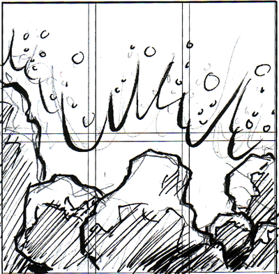 |
| those lines are my outline for the nine-panel grid - this panel is 2/3 of the page |
So for this scene, I didn't want smooth, japanese garden rocks - I wanted hard, jagged, "HOLY CRAP - ROCKS!!!" rocks. They're getting pounded by the surf, but still appear immovable. You should feel like if you were in between the rocks and the surf, you'd be totally mangled! It's so much easier to capture raw emotion in a thumbnail, which is what I did here.
 |
| I circled the edges - look how many more lines are there |
after blowing up my rough and transferring it to a piece of bristol with my handy light table, I start sketching in the details. A key thing about rocks - they're made up of planes, but you see more planes towards the edges. So your lines should "bunch up" around the edges.

When inking I basically outline the planes with a brush and then take a pen (crow quill Hunt 102, the standard) to shade some of the planes. I could just shade them with my blue tones, but when you can get bunch of parallel lines in one direction on a plane, it gives more depth to the rock. When these planes join and intersect, it gives a real shape and definition to the form.
Finish it up with a G-Pen for those fire-like waves, throw in some color and I'm done. Hooray! This page is kinda like an exclamation point - I wanted it to be loud !
 |
| ! |
1 comment:
Just saw the video preview of Power Out. Wow, really good stuff. I'm gonna get a hold of one copy for myself. oh, btw cool site!
Post a Comment